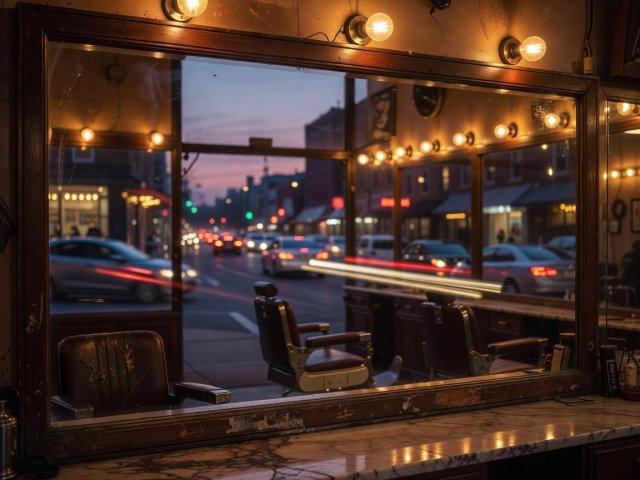
 Mixed Kelvin
2700K Interior Meets Twilight
Locking white balance at 4500K during dusk preserves the cozy amber warmth of vintage shop bulbs against cooling street stone.
See Night Bus Exhibition Notes →A busy street contains every hue imaginable, which is why unedited colour frames so often feel chaotic. The secret is subtractive discipline: anchor your frame in warm near-blacks and weathered stone so a single flash of coral or amber commands the eye.
Start a Photo Walk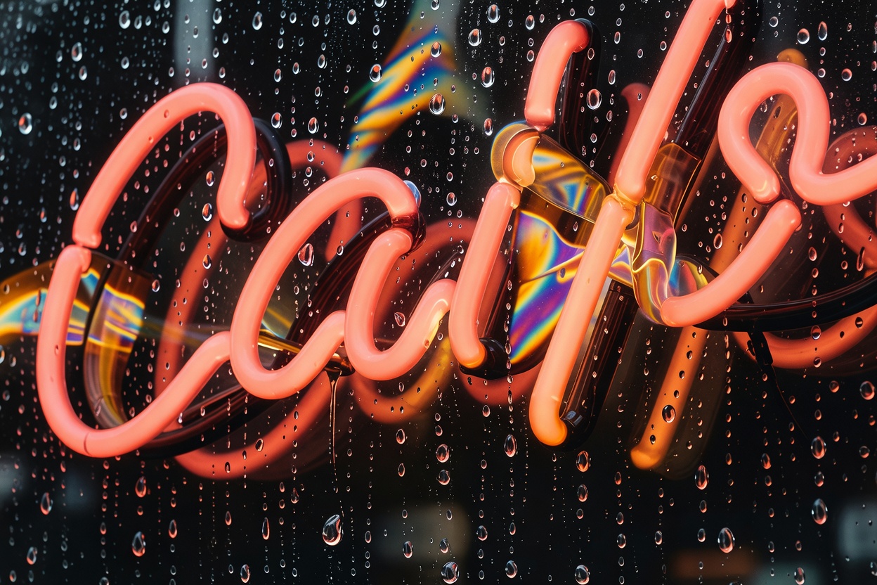
When Fred Herzog photographed Vancouver's storefronts and neon signs in the late 1950s, or when Harry Gruyaert captured the saturated, deep-shadowed streets of Antwerp and Marrakech, they proved that colour street photography thrives on restriction. If seven competing primary colours appear across billboards, parked cars, and synthetic jackets, the viewer's eye has nowhere to rest.
Train yourself to scan for two-note or three-note colour chords before looking at the subject. A terracotta awning above a dark espresso wall needs only a fleeting ochre scarf or a warm brake light reflection to complete a triad. By tightening your framing or changing your camera height by six inches to hide a distracting plastic storefront sign, you turn colour from background noise into the primary narrative engine of the photograph.
Default camera matrix meters are programmed to turn every scene into middle grey. On a city street, that automated habit ruins atmosphere: it blows out sunlit cheekbones and illuminated tram boards while lifting dark alleyways into muddy, noisy brown. Instead, switch to highlight-weighted metering or dial your exposure compensation between -1.0 and -2.0 EV.
When you protect the brightest source in the frame—a shaft of sunlight hitting a brass doorknob or the warm tungsten filament inside a kiosk—everything two stops darker drops into rich, velvet shadow. Colours within the illuminated zone become denser and more saturated, echoing the look of classic slide film.
| Urban Lighting Scenario | Recommended EV Compensation | Colour & Contrast Outcome |
|---|---|---|
| Harsh Afternoon Canyon Slit Light | -1.3 to -2.0 EV | Deepens surrounding asphalt into clean near-black; saturates warm skin tones and wool textures in the beam. |
| Wet Overcast Drizzle & Puddles | -0.7 EV | Prevents pale sky reflections from clipping on wet cobblestones; preserves subtle brick and rust tones. |
| Dusk Sodium-Vapor & Shop Windows | -1.0 to -1.7 EV | Keeps interior incandescent bulbs and neon tubes glowing warmly without washing out into white halos. |
Every observant walker eventually asks whether a sequence belongs in colour or black-and-white. Rather than treating monochrome as a rescue button in post-processing when colours clash, make the decision on the pavement. When the emotional weight of a moment depends on temperature—the warmth of a roasted chestnut brazier against cold November mist, or the amber glow of a late-night diner counter—colour is irreplaceable.
When the scene is purely about graphic rhythm, tactile grain, and harsh mid-day geometry—in the lineage of Daido Moriyama's high-contrast Tokyo streets or Fan Ho's luminous Hong Kong alleys—monochrome strips away chromatic distraction so line and texture speak alone.
Mixed Kelvin
Locking white balance at 4500K during dusk preserves the cozy amber warmth of vintage shop bulbs against cooling street stone.
See Night Bus Exhibition Notes →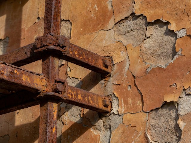 Monochrome & Earth
Harmony doesn't always require opposite colours; layering rust, sand, walnut, and coral creates quiet, tactile depth.
Explore Contemporary Prints →